


lettering Tattoo - Font Design
Saman rezazadeh
When I want to explore a tattoo idea without opening a full design program, lettering Tattoo - Font Design is the kind of app I reach for first. It focuses on words rather than complete illustrations, so the experience feels direct: choose a script style, type a name or phrase, adjust the look, and decide whether the result is close enough to keep developing. I found it especially useful for testing the mood of a tattoo before showing an artist a more definite reference.
This is a free art and design app made by Saman rezazadeh, with an Everyone age rating and support for Android 6.0 or later. Its appeal is easy to understand: it gives lettering fans a quick place to experiment with cursive calligraphy and tattoo-style text, including when an internet connection is not available. The current version is 3.7.1, and the app has reached over 100 thousand installs with a 4.5 average from around 1.5 thousand ratings. Those figures suggest that it has found a practical audience, although popularity alone does not make it a substitute for professional tattoo design software.
Starting with a simple lettering workflow
My recommended first session is deliberately uncomplicated. I begin with the exact word, initials, date, or short phrase I am considering, rather than filling the canvas with placeholder text. Tattoo lettering is highly dependent on the shape and length of the real wording, so testing with “something similar” can give a misleading impression. A short name may look balanced in one font, while a longer phrase can become crowded or lose its rhythm.
After entering the text, I compare several cursive styles before changing anything else. This is more useful than immediately trying to force one font to work. Some lettering feels soft and decorative, while another style gives the same phrase a sharper, more assertive identity. I pay attention to the capitals, the connection between letters, and the way the final letters finish. Those details matter more for a tattoo than simply choosing the most elaborate-looking script.
The offline editor is an important part of the experience. I can work on a concept during a commute, in a waiting room, or somewhere with unreliable reception without treating the app like a web-based design service. That does not mean every part of a tattoo project is completed inside the app. Rather, it makes the early idea stage convenient. I can test wording and visual direction first, then move the strongest concept into a more advanced workflow later.
Related News

Why WhatsApp Messenger Still Makes Everyday Communication Feel Easy

Jurassic World: The Game Is the Better Dino Tycoon for Strategic Players

Threads in Real Life: Who Should Join, Lurk, or Leave

How SHEIN Turned Shopping Into an Endless Content Feed

How to Make Fortnite Feel Smarter on Mobile

Should You Switch to Microsoft Outlook on Mobile?
A realistic example is planning a small family-name tattoo. I would enter the name, test a few script treatments, and look at the spacing around the first and last letters. Then I would try the same lettering at a larger visual scale before deciding whether the design still feels readable. A result that looks attractive as a tiny phone preview may become too dense when translated to skin, so I treat the app as a concept filter, not as final approval.
The most useful habit is to judge the whole word, not isolated letters. Script fonts can make individual characters look beautiful while producing awkward joins when they appear together. I often compare the complete phrase several times, because the overall flow is what a viewer will notice from a normal distance.
Settings worth checking before settling on a style
The app is easiest to use when I make changes in a fixed order. First I choose the wording. Next I compare fonts. Only after that do I work on the visual adjustments available in the editor. This prevents a common mistake: spending time polishing a style that does not suit the word in the first place.
Gallery
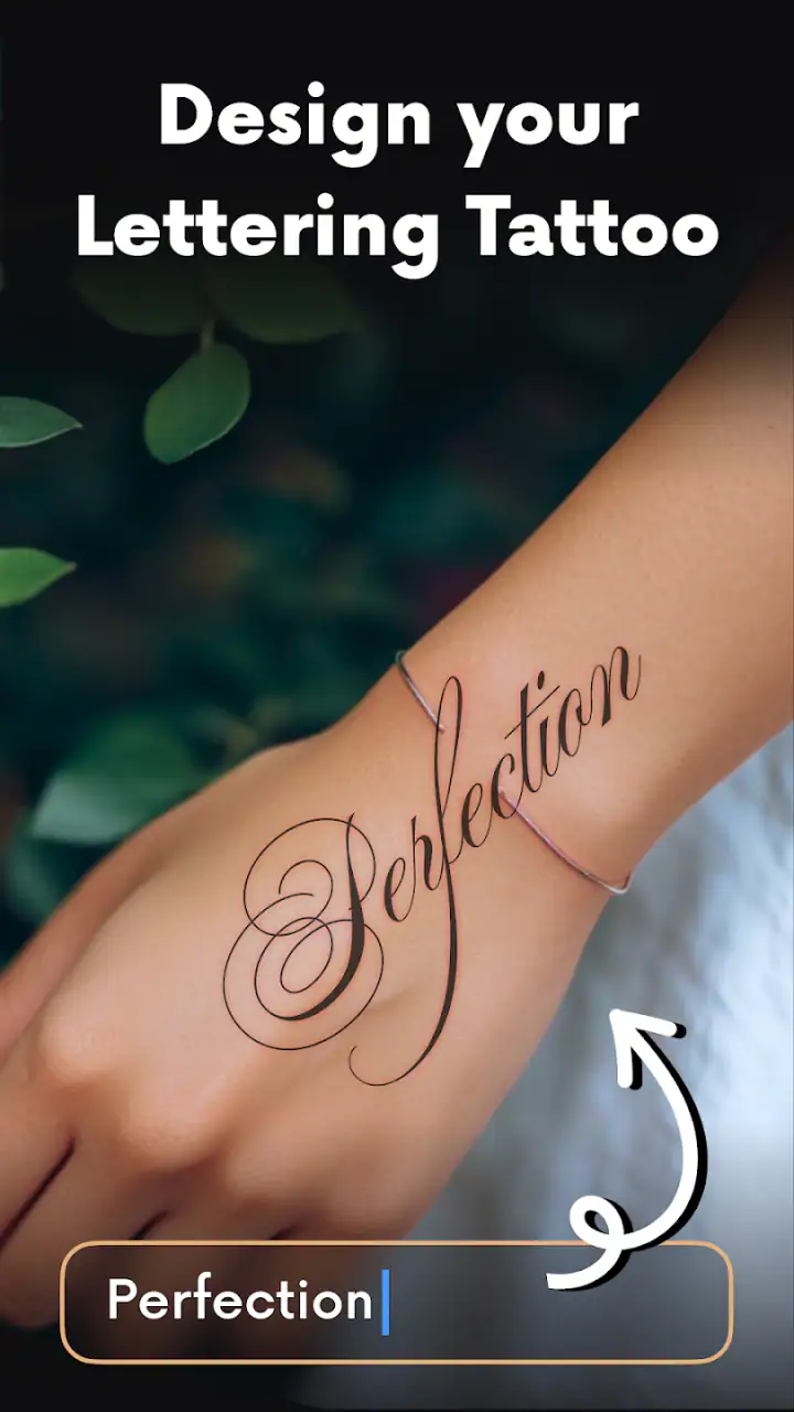
I also check whether the design remains legible when viewed smaller than the editing preview. Tattoo lettering needs to survive more than a close-up inspection on a bright phone display. Thin strokes, tight loops, and decorative flourishes can blend together once the design is reduced or transferred to a different surface. The app helps me identify that risk early, even though the final tattoo will still depend on an artist’s stencil and technical judgement.
Another useful check is visual balance. I look at the left and right edges of the phrase and ask whether one side feels heavier. A beginning capital can dominate the rest of the word, or a long ending stroke can make the composition appear to lean. If the lettering feels unbalanced, changing the font is often more effective than repeatedly adjusting the same design.
Because in-app purchases range from $1.99 to $29.99 per item, I would explore the free experience carefully before paying for anything. The free starting point is enough to decide whether the editor’s approach suits you. If you are considering an optional purchase, I would first test your most important words and compare the styles you can already access. That makes the decision practical rather than based on curiosity alone.
The free price makes the app approachable for a first experiment, but “free” should not be confused with unlimited professional capability. Someone who only wants to preview a name may find the basic experience sufficient. Someone building a complete tattoo portfolio should think about whether the available editing depth, export workflow, and lettering control match their needs before spending money inside the app.
Repeatable patterns that make design sessions faster
Experienced users can save time by creating a small comparison routine. I use the same phrase in several styles, keep the wording unchanged, and compare the results side by side in my own notes or screenshots. This removes the distraction of changing multiple variables at once. If the phrase, font, and layout all change together, it becomes difficult to understand what actually improved the concept.
A second pattern is to prepare variations with different levels of restraint. I might start with a clean script, then try a more decorative option, and finally return to the simplest version. This gives me a useful range rather than a collection of nearly identical designs. The plainest result often communicates best, especially for a small tattoo or wording that needs to remain readable for years.
I also recommend checking the design after taking a short break. Lettering can look impressive during an intense editing session because the eye becomes accustomed to its details. Returning to it later makes obvious problems easier to spot: a letter that resembles another character, a flourish that distracts from the word, or spacing that feels uncomfortable. The app is quick enough that this second pass does not need to become a major project.
For a consultation with a tattoo artist, I would bring more than one version. The strongest reference is not necessarily the one with the most decoration; it is the one that clearly communicates the preferred lettering direction. Showing a simpler alternative also helps the artist explain what can be adapted to the body area, needle size, and intended scale.
One non-obvious advantage of an offline lettering editor is that it supports spontaneous comparison. If someone asks for a variation while you are away from a stable connection, you can still work through the wording and visual choices. That makes it useful for personal brainstorming, although I would still keep a separate copy of any design I consider important rather than relying on memory.
Where the app reaches its practical limits
Lettering Tattoo - Font Design is focused, and that focus is both its strength and its boundary. It is well suited to trying script lettering, but it should not be mistaken for a complete tattoo composition tool. If your idea includes detailed botanical elements, realistic shading, geometric construction, or a carefully measured sleeve layout, you will probably be better served by a drawing app or by working directly with a tattoo artist.
The app also cannot decide whether a design is technically safe or durable on skin. A digital preview does not account for every body contour, the movement of skin, healing, ink spread, or the way very fine details may age. I use the editor to communicate an idea, never to overrule professional advice about size, placement, and line weight.
There is another limitation in the nature of cursive lettering itself. Script can look personal and elegant, but it is not always readable to other people. If the phrase carries an important meaning, I would ask someone unfamiliar with it to read the preview. If they consistently misinterpret the word, that is a warning to simplify the style or choose a clearer treatment.
People who need precise vector paths, layered artwork, custom letter construction, or extensive color control may find the app too narrow. A conventional illustration editor provides more room for manipulation, while a specialist typography tool may offer better control over kerning and individual glyphs. The trade-off is speed: those alternatives usually demand more learning and more setup before producing a useful first idea.
I would also skip this app if my main goal is to generate a finished stencil without further review. A tattoo is permanent, and a visually attractive screen design still needs checking by the person who will tattoo it. The app is strongest as a fast visual conversation starter, not as a final authority.
Who will get the most from this editor?
I think it is a good match for first-time tattoo planners, people collecting lettering references, and anyone who wants to test a meaningful word before contacting an artist. It is also handy for users who prefer working offline and do not want to learn a complicated drawing interface just to compare script styles.
It can help tattoo artists during an early consultation as well, provided it is treated as a quick lettering reference rather than a replacement for their own design process. A client can arrive with a clearer idea of the tone they want: delicate, bold, flowing, compact, or more readable. That can make the conversation more productive even when the final lettering is redrawn professionally.
On the other hand, I would point illustrators toward a broader drawing application if their concept depends on custom artwork around the text. I would also recommend a more advanced typography or vector workflow to anyone who needs exact print-ready control. The right choice depends on whether the difficult part is choosing a lettering mood or constructing a technically precise final design.
My verdict after using it as a lettering sketchbook
My overall impression is positive because the app understands its most useful role: quick, accessible exploration of tattoo lettering. It does not bury the central task under a large creative suite. I can start with a phrase, compare cursive directions, and decide whether an idea deserves a more serious design session. The offline editor makes that process particularly convenient when I am away from dependable internet access.
The developer, Saman rezazadeh, has positioned the app in a clear niche within art and design. Its Everyone rating also makes it approachable for a broad audience, although the permanence of tattooing means younger users should still involve a responsible adult and a qualified professional when appropriate. The app itself is easy to approach; the decision to tattoo a design should be much more deliberate.
My advice is to use it in stages: test the exact wording, compare several scripts, inspect legibility at a smaller view, revisit the concept later, and take the best few references to a tattoo artist. Do not judge a design only by how decorative it looks, and do not assume an in-app purchase will solve a weak composition. A better font choice and more breathing room often matter more than extra ornament.
For a free starting point, lettering Tattoo - Font Design offers a useful balance of speed and focus. I would not choose it for a complete illustration or precision typography project, but I would recommend it to a friend who wants to explore a name, quote, or set of initials before committing to ink. Its real value is helping you make a clearer decision before the permanent part begins.
FAQs for lettering Tattoo - Font Design
What is Lettering Tattoo - Font Design used for?
Lettering Tattoo - Font Design is intended for creating and exploring tattoo-style lettering concepts. It can help you preview different fonts, arrange words or short phrases, and experiment with visual ideas before taking a design to a professional tattoo artist. It is best treated as an inspiration and planning tool rather than a replacement for custom consultation, stencil preparation, or professional tattoo design work.
Does Lettering Tattoo - Font Design offer enough fonts and customization options?
The app focuses mainly on typography-based tattoo concepts, so its usefulness depends on the variety of lettering styles available and how much control you want over the final layout. Users can generally compare font appearances and create different text arrangements, but advanced illustration tools may be limited. If you need detailed symbols, complex shading, or a completely original hand-drawn design, additional editing software may be necessary.
Can I use the designs created in the app as an actual tattoo stencil?
A design made in Lettering Tattoo - Font Design can serve as a useful visual reference, but it should not automatically be considered a finished tattoo stencil. Tattoo artists often need to adjust spacing, line thickness, sizing, and readability for the body area selected. Before using any design permanently, export or show the concept to a qualified tattoo artist and ask them to refine it for safe and accurate application.
Is Lettering Tattoo - Font Design suitable for beginners?
Yes, the app is generally approachable for beginners who want to test tattoo lettering ideas without learning complicated graphic-design software. Its straightforward concept makes it useful for comparing fonts and imagining how a name, quote, or date might look. However, beginners should remember that an attractive screen preview may look different on skin, especially when size, body curvature, ink spread, and long-term readability are taken into account.
Is Lettering Tattoo - Font Design free, and does it require an internet connection?
Availability, pricing, advertisements, and optional purchases can vary depending on the platform and version installed. Some features or font collections may require payment, while certain functions may work offline after the app has loaded its resources. Check the current Google Play Store or App Store listing before downloading, particularly if you want to avoid subscriptions, understand in-app purchases, or confirm compatibility with your device.
Pros
- Wide range of tattoo-inspired fonts for creative lettering projects.
- Simple interface makes browsing and testing fonts quick and convenient.
- Useful for planning tattoo concepts before showing them to a professional artist.
- Supports visual experimentation with different lettering styles and layouts.
- Good source of inspiration for custom designs and typography ideas.
Cons
- Some fonts or design tools may require in-app purchases to unlock.
- The app may offer limited control over advanced typography settings.
- Export options can be restricted depending on the device or app version.
- Font quality and readability vary considerably between available styles.
- Design previews may not accurately represent the final tattoo appearance.


